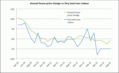
I've cobbled together a chart showing Nationwide's monthly figures for annual house price changes and the Conservatives' lead over Labour in the opinion polls (from here). Positive means the Conservatives are ahead, negative means Labour are/is ahead.
The co-efficient of correlation is 0.76, which seems pretty high to me.
Hit or Miss
41 minutes ago


2 comments:
No guesses what that graph would look like if they introduced a 100% LVT tomorrow then.
But hold on. Is there another graph showing disposable income? Coincidence? Maybe, but I don't think so. If you could get that moving the other way maybe house prices won't be so important?
Yaaay! My glass is half full again.
BS, I can imagine it would be unpopular with a lot of people, but assuming other taxes were cut accordingly, most people would have much more disposable income afterwards (losing less on the LVT swing than they gain on the tax-NIC roundabout) so we don't know.
That said, changes in Tory popularity and house prices might be both caused by changes in something else (such as disposable income, like you say).
Post a Comment